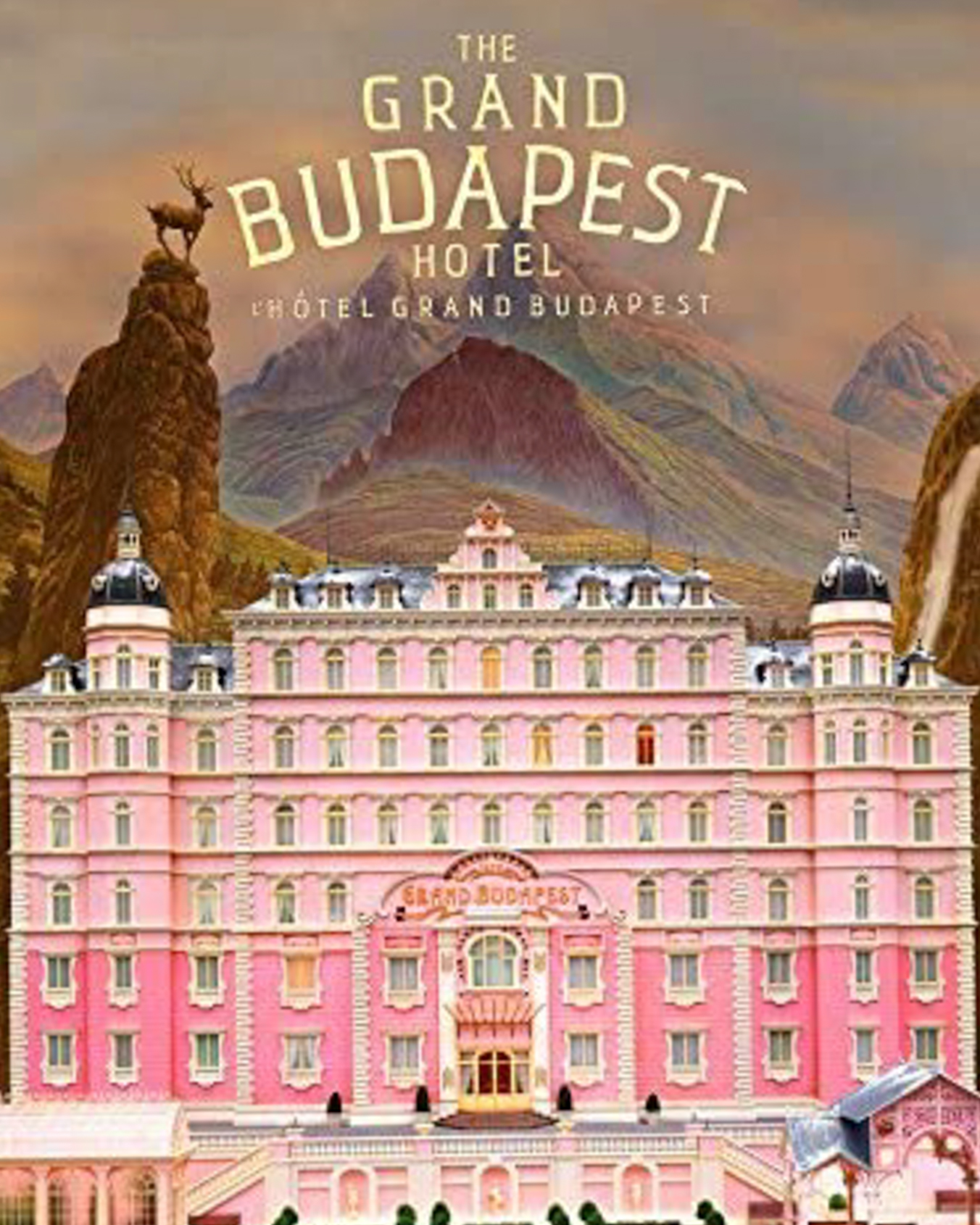
23 Nov AESTHETICS of wes anderson
Wes Anderson’s style is one of the most distinctive in contemporary film. The most obvious parts of his aesthetics are bold colours and costume and location design, but we can`t forget there are numerous subtle ways he creates his distinctive look.
But Wes Anderson is not a cinematographer- he’s a writer and director. There is someone else as important as Mr. Anderson…. Robert Yeoman, one of the most creative cinematographers today. Yeoman has helped to create the visual template associated with Wes Anderson, so much so that Anderson has not worked with another cinematographer for any of his live-action feature films.
If you watch non-Anderson films that Robert Yeoman has shot, you will see that what he does differently, and what influence he has had on Anderson.
Anderson and Yeoman often present images in symmetrical, flat compositions. This furthers the “storybook motif” that Anderson creates with his visuals, letting viewers feel like they are moving through some sort of doll house world.
Anderson and Yeoman construct their visuals in a very particular way. The way the artists use colours and composition of the image is truly masterful.
Colour influences mood and create atmosphere. Artists use its psychological effects to evoke feelings in a viewer and to tell a story. It can elicit emotion from the audience, and the same colors can be connected to different emotions based on how you mix the colors, the surrounding imagery, and the general emotional tone of the scene. In short, the colours help define, the complete world of the film.
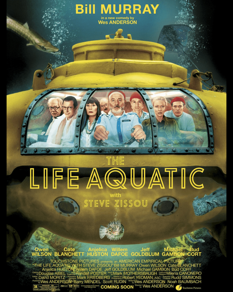
Anderson employs colour to an extraordinary degree. In The Life Aquatic with Steve Zissou (2004), there’s a prevalence of blue and orange shades in the sets and costumes, which reflect the marine environment and also echo the melancholy of Bill Murray’s titular character.
Zissou’s crew are all seen wearing matching blue uniforms and red knitted beanies. The woollen headwear is incongruous to the ensemble but is vital to the storytelling. (And reminiscent of the clothing worn by Jacques Cousteau, a character upon whom Zissou is clearly based.) Red is an emotionally intense colour and Anderson frequently employs it to represent grief. In this instance, Zissou is devastated by the loss of his friend and partner Esteban du Plantier, and his red beanie reflects this.
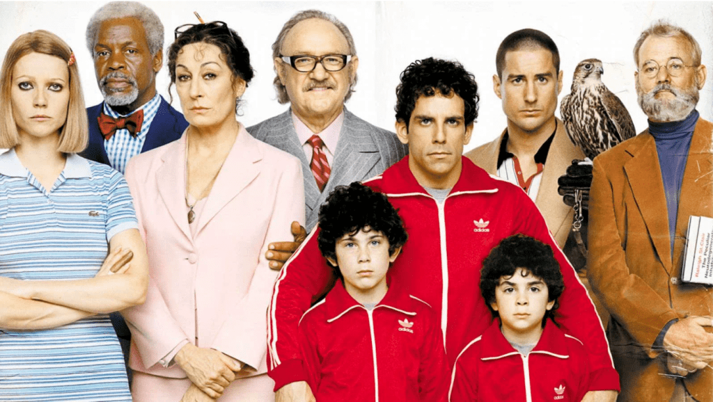
In The Royal Tenenbaums (2001), we see Chas (Ben Stiller) wearing a red tracksuit to mourn the death of his wife and the sense of abandonment he felt growing up.
In The Darjeeling Limited (2007), the brothers are also seen driving a red car after the death of their father.
In addition to colours connoting specific feelings, Anderson also presents a characteristic brightness, saturation and hue in his films. With Moonrise Kingdom (2012), he continued to embrace the aesthetics of his animated features, creating a world awash with yellow.
Anderson’s colour palettes are exaggerated and prominent, instilling a sense of nostalgia and harking back to his 1980s childhood. The other effect of his elaborate use of colour is that he creates a world far removed from reality. This means he can get away with a more fanciful plot and outlandish storylines because it all takes place within what is perceptibly a contrived reality.
Anderson and Yeoman are renowned for using symmetry in their films. While pleasant to watch, this kind of composition also contributes to the fanciful, beguiling appearance of his films.
In almost every shot there is this symmetry. Those that focus on a single character almost always place them in the centre of the frame, and where there are multiple characters, they often mirror each other on either side of a central point of the composition.
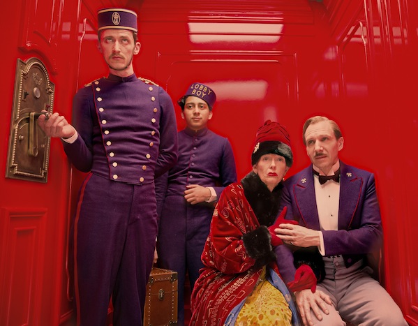
If we look closely there is symmetry in almost every shot. Those that focus on a single character almost always place them in the centre of the frame, and where there are multiple characters, they often mirror each other on either side of a central point of the composition.
While speaking about composition – there is one more key point to it. The images look a certain way because of planimetric composition. Planimetric composition refers to the technique of making backgrounds seem flat in contrast to central figures in the foreground. Anderson makes liberal use of this and the constructed tableau vivant result heightens the highly constructed feel of his films.
There is two more aspects I would like to touch on – crucial for building any scene, story or film, that is costumes and set design.
COSTUMES AND PROPS
Wes uses a technique called “Character Uniforms”, described by Jean-Luc Godard- a French-Swiss a pioneer of French New Wave film movement, film director, screenwriter and film critic, from the 1960s. Designing a character uniform is similar to a cartoon character, the viewer is able to associate a consistent look with a specific character. The viewer forges a more significant relationship along with a set of expectations for each character.
Perhaps the best examples of this can be found in the clothing worn in The Royal Tenenbaums, designed by Karen Patch. Take Margot Tenenbaum’s (Gwyneth Paltrow) long fur coat. It reflects her icy and distant exterior, while also acting as a thick, warm layer of protection from the world. Her various tennis dresses, on the other hand, connect her to her former tennis-star brother and give her an infantilised appearance.
There is a certain psychological comfort that comes from knowing what a character is supposed to look like. Anderson’s costume choices leave no room for imagination, he’s being deliberate and removing all doubt.
If we are supposed to think of Willem Dafoe’s character as intimidating and ominous, as in The Grand Budapest Hotel, he shows up wearing black leather and brass knuckles. What if we are supposed to think of Willem Dafoe’s character differently, say… as a goofy sidekick? In The Life Aquatic, he shows up in short shorts and a goofy-looking beanie with a puffball on top. Also, the crew members of the research vessel Belafonte wear the same red hats, but the characters tie the hats differently.
It is a small detail, some might even say a relentless detail, but it is yet another example of how three characters can ostensibly wear the same article of clothing. The manner in how they wear it says oodles.
Props are just as important to creating a unique film world as the set and costumes. Kris Moran worked as a set decorator and prop master on several of Anderson’s films, including Moonrise Kingdom and The Royal Tenenbaums. Moran and her team work from Anderson’s detailed storyboard to bring the film to life
SET DESIGN
Everything is carefully thought through when it comes to Wes films. Director wants us to pay attention to every detail that is shown on a screen. And Set design isn`t any different from that. Production designer Adam Stockhausen won an Oscar for creating the imaginative and fanciful set of The Grand Budapest Hotel (2014). He stated that Anderson has a very specific visual style and he outlines his vision meticulously. This necessitates that the set is designed frame by frame and adheres to Anderson’s stipulations about colour.
Stockhausen described how they used the interior of a derelict hotel in Görlitz, Germany, for more than a dozen of the film’s sets. In his role as art director on The Darjeeling Limited, Stockhausen designed a whole train-cart interior and an exact copy of it facing the other direction.
I have to admit- researching Wes, I again not only fell deeply in love with his films… but I fell into a research rabbit-hole. People did endless analysis of his style- even down to the choices of fonts.
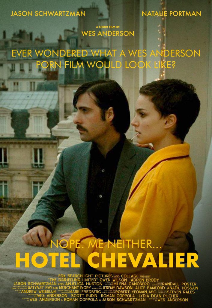
He definatly influenced modern culture, and is now rooted in my way of seeing a world. There is also quite decent amount of memes, and inspirations that creators and internet culture took on – and here is just a tiny fraction of what I found. Enjoy.
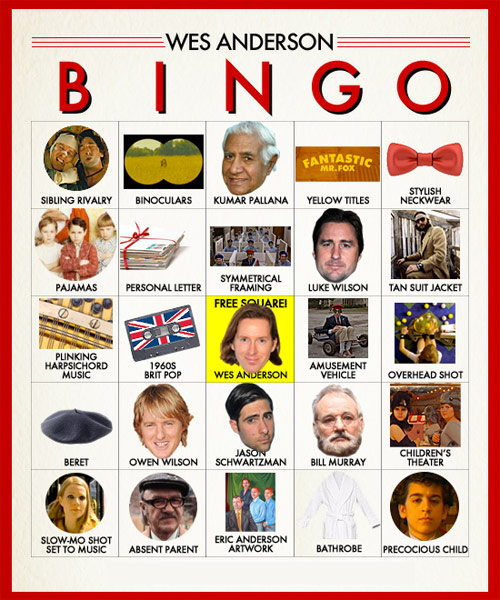


No Comments